Weather Homepage redesign
Role
UX Research
UX Designer
Team
UX design
Product owners
Dev team
Creative director
Company
BBC
Project time
3 months

My Role
I co-led the user research for the BBC Weather homepage redesign, focusing on validating four new homepage concepts. I was responsible for:
-
Reviewing previous research to build on existing insights.
-
Designing the research plan and discussion guides.
-
Recruiting and coordinating participants via UserZoom.
-
Facilitating 1:1 remote interviews with prototypes built in Figma.
-
Analysing findings into actionable insights and recommendations.
-
Collaborating with designers and engineers to refine and prioritise homepage features.
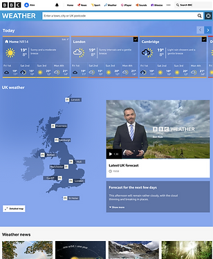
The Goal
To design a homepage that helped users reach their forecasts quickly, provided richer and more relevant weather information, and stayed clean and easy to use.
The Challenge
The team needed to prioritise new homepage features that:
-
Enabled faster access to forecasts via saved locations.
-
Added richer map data (rain, wind, temperature, warnings) without overwhelming users.
-
Made the homepage feel more localised and useful.
All while maintaining a clean, uncluttered design.
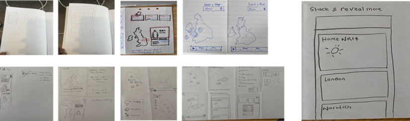
Research Approach
We reviewed prior research to identify user needs: simplicity, relevance, and direct navigation.
Which then lead to us conducting 12 in depth remote interviews using Figma prototypes and structured discussion guides on UserZoom.
I then co-designed four homepage prototypes in collaboration with design and engineering teams:
-
Fast forecast access via a carousel with saved locations at the top
-
Data-rich map layers (rain, temperature, wind, warnings)
-
Localized map views
-
Inline video content for seamless engagement


Outcomes & Impact
-
Provided clear evidence to prioritise saved locations and forecast carousel as the homepage anchor.
-
Influenced design decisions that shaped the Webcore migration roadmap.
-
Helped secure stakeholder buy-in by validating new concepts with user feedback.
-
Improved clarity for signed-out users by highlighting the need for clearer sign-in messaging.
-
Strengthened collaboration across design, research, and engineering by grounding next steps in user insight.
Recommendations & Next Steps
-
Prioritise saved locations and forecast carousel at the top of the page.
-
Keep map data layers lightweight and avoid information overload.
-
Refine the empty state to clearly communicate the sign-in requirement.
-
Share findings with product and engineering teams for iteration.
-
Continue testing higher-fidelity designs in Webcore before rollout.